Why Repeated Frames and LED Light Make an Atrium Feel Larger

A fixed-size atrium can feel larger than it is when bright rectangular frames repeat through the space, even though the floor plan has not changed, and the reason is less magic than a very willing visual system. Your eyes treat those repeated lit edges as a depth signal, not just decoration, and once you know that, a lot of modern interiors become easier to read.
عرض النقاط الرئيسية
- Repeated rectangular frames make the eye read a flat interior as a sequence extending deeper into space.
- Bright contrast along edges strengthens depth perception by giving the visual system clear borders to follow.
- The effect connects to boundary extension, where people remember scenes as larger than what was actually visible.
- ADVERTISEMENT
- Several illuminated frames work better than one dramatic light feature because repetition suggests a visual path.
- Symmetry and alignment reinforce the illusion by creating tidy perspective cues and a stronger vanishing pull.
- Measured size and perceived size are different, so modest rooms can feel larger when depth cues are well designed.
- The illusion fails when clutter, glare, weak contrast, or irregular spacing interrupt the readable sequence of frames.
That is the whole trick up front: nested geometry, strong contrast, and repetition persuade the brain that space keeps extending away from you. Architects cannot stretch concrete after the fact, but they can stretch your sense of distance.
Why your eye turns glowing rectangles into extra room
Start with the simplest sketch you could make on paper: one rectangle inside another inside another. If the edges are clear and evenly spaced, your brain does not read them as flat ornament for long. It starts reading them as a sequence moving away from you.
قراءة مقترحة
Vision scientists have been picking at this for a long time. In 2011, Helene Intraub and Mary Dickinson reported in Cognition studies using controlled scene images and lab participants that people remember views as if they included more space than was actually shown, a result called boundary extension. In plain English, the brain is already inclined to imagine a scene continuing beyond its visible limits, and repeated frames give that habit something neat and orderly to grab onto.
Now add light. A bright edge against a darker surface makes a border easy for the eye to lock onto. Those borders act like guide rails. Instead of seeing one ceiling opening or one structural bay, you see a run of them, and your perception starts stacking distance from edge to edge.
Environmental psychologists have also shown that brightness and contrast affect how spacious interiors feel. A useful summary comes from a 2014 review by Jiyoung Lee and colleagues in Frontiers in Psychology on architectural experience: visual features such as light, enclosure, contour, and proportion shape how people judge space before they think about measurements. The testable version is simple: take a clear, bright-edged opening and repeat it, and most people will feel more pull and more depth than from a plain, evenly lit ceiling.
This is why repeated illuminated frames often work better than a single dramatic light feature. One frame says, “here is an opening.” Several frames say, “here is a path.” The eye loves paths.
The midpoint test that flips the whole room
Would this room still feel as large without the repeated glowing frames?
Usually, no—or at least not in the same way. Remove the repetition and you lose the nested geometry. Reduce the contrast and the edges stop reading clearly. Flatten the sequence and the vanishing pull weakens. Keep the same square footage, and the mental stretch shrinks fast.
That is the real turn in the trick. You are not mainly responding to “fancy lighting.” You are responding to a machine for depth reading: frame, contrast, vanishing pull, repetition, expectation. Once those cues line up, the room can feel longer, taller, or more open than its tape-measure facts.
Walk through it slowly and you can feel the illusion being built
Imagine entering a museum atrium or transit hall that uses this idea well. First, your eye catches the nearest bright border because it is the strongest edge in view. A second later, it notices another similar border farther in, then another, and now the space stops feeling like one volume and starts feeling like a folded corridor opening layer after layer.
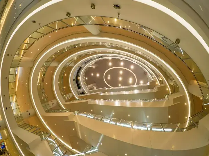
Third comes the strange part: your brain starts predicting more of the same. Repetition creates expectation. If one bright rectangle leads to another in clean rhythm, you assume continuation, and that assumption adds a little phantom distance to the room.
Architects use this in lobbies, atriums, and station halls because symmetry helps the effect hold together. When the frames line up on a central axis, the visual system gets a tidy perspective cue. It is the same reason notebook doodles of tunnels and stairwells worked when we were kids: regular edges plus convergence equal depth, even before the rational part of the mind weighs in.
Maybe it only looks big because it is big. Fair point.
Sometimes a room feels large because it simply is large. Height matters. Width matters. Volume matters. No amount of lighting can turn a cramped hallway into a cathedral.
But measured size and felt size are not identical. A tall room with flat lighting and visual clutter can feel oddly compressed. A more modest room with strong edge contrast, clear symmetry, and repeated framing can feel more expansive than its raw dimensions suggest.
That distinction shows up across architecture research and practice: spaciousness is a perception, not just a number on a plan. Ceiling height, brightness distribution, enclosure, and visible depth cues all push that perception around. Repeated illuminated frames are effective because they bundle several of those cues into one clean visual signal.
Why the trick sometimes fails anyway
This effect does not work equally in every building. If the proportions are awkward, the glow creates glare, the surfaces are busy, or the contrast is muddy, repetition alone will not create spaciousness. The eye needs clean edges and a readable sequence.
Clutter is a frequent spoiler. Hanging signs, exposed equipment, mismatched materials, and stray light sources break the rhythm, so the brain stops reading one extending system and starts reading many competing objects. The same goes for frames that are too close together or too irregular; instead of depth, you get visual fuss.
So the trick is not “add LEDs and wait for futurism.” It is more exact than that. The frames must repeat clearly enough to be grouped, bright enough to define edges, and simple enough that the eye can convert them into a receding sequence.
What to notice the next time you step into one
Here is the useful takeaway. When you enter a modern lobby, station, hotel atrium, or gallery, ignore the style words for a moment. Look for repeated rectangular openings or light bands, then ask whether they are creating nested layers, sharp edge contrast, and a strong central pull.
If the answer is yes, you are probably feeling perceived extension, not just admiring expensive finishes. That is a learnable piece of visual intelligence, and it gets fun very quickly.
Buildings become less mysterious once you know where the illusion lives. Notice the repeated frames overhead or ahead of you, and the next striking interior may feel less like a trick and more like a readable, clever conversation with your eyes.