The Artificial Cliff That Makes This Castle Feel More Powerful
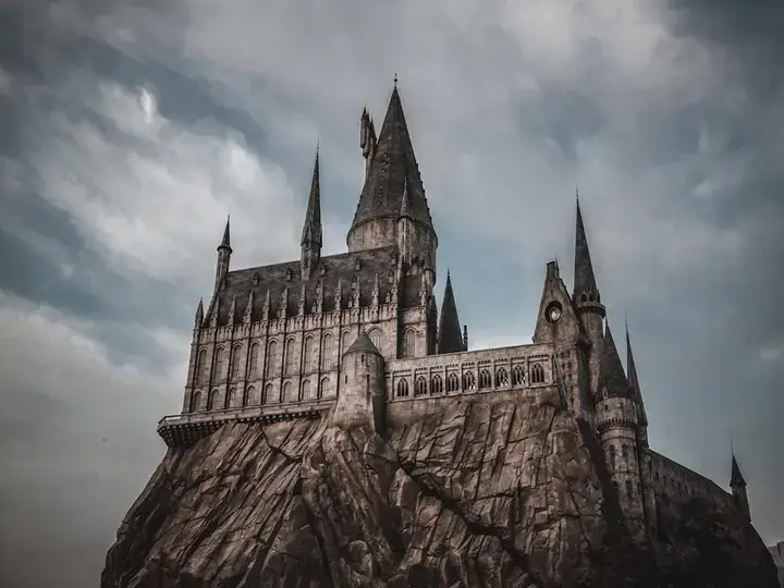
The part of Hogwarts Castle doing as much work as the towers may be the artificial rock beneath it—because that base changes how your eye measures height, weight, and importance before you even realize it. Stand in the intended approach, and the castle feels huge not only because of spires and steep roofs, but because the whole composition has been built to make those features hit harder.
عرض النقاط الرئيسية
- The artificial rock base elevates Hogwarts Castle physically and psychologically, making it feel separate from normal human scale.
- By hiding familiar scale clues like doors, railings, and pavement edges, the rocky plinth makes the castle seem more mythic and dominant.
- Water in the foreground adds reflection and visual stability, increasing the castle’s perceived mass and presence.
- ADVERTISEMENT
- The illusion works in sequence: the eye reads the base first, then the mass, and finally the towers and rooflines.
- Forced perspective in the upper levels makes the castle appear taller by scaling architectural details smaller as the structure rises.
- The grandeur is strongest from carefully controlled approach angles, where the bridge and shoreline organize the visual layers.
- The castle’s impact comes from staged perception, with rock, water, and architecture working together to create engineered majesty.
Theme-park designers have talked openly for years about using forced perspective to make buildings read larger than they are. At Disney parks, former Imagineering leaders including John Hench explained that upper levels are often scaled smaller so the structure appears taller from guest level; the same visual logic shows up across themed environments, even when the style is very different. Here, though, the first trick is lower down: the cliff is helping to make the castle feel mythic before your eye gets to the architecture.
قراءة مقترحة
The biggest trick is hiding in plain sight at the bottom
Start with the base. Rock does two jobs at once. Physically, it lifts the building above the guest path. Psychologically, it removes the castle from normal human scale, so doors, windows, and wall lines are no longer being judged against your body in the usual way.
That matters more than most people think. If a large themed building rises straight from pavement, your eye quickly finds scale clues: railings, people, storefront edges, hand-height details. Put that same building on a rugged plinth, and the eye reads one dominant mass first. The castle stops feeling like a building you could walk up to and starts feeling like a place set apart.
Hard cut: this is why the rock is doing as much emotional work as the castle itself. It is not decoration around the icon. It is the first stage of the ascent, the thing that tells your brain, before the towers even register, that this structure belongs above you.
Did you notice the rock before you noticed the towers? If you did, your eye was following the design exactly as intended. If you did not, that also proves the point, because the base had already done its job quietly by priming your scale judgment before you consciously named it.
Now pause for a second and listen. Down by the artificial shoreline, there is that soft lap of water against the edge beneath the facade, a calm little sound while people keep moving behind you. That water is not just atmosphere. It gives the composition a clean foreground and a reflected one, which makes the whole mass feel steadier, broader, and more settled in the scene.
Reflection changes perceived size in a simple way: it doubles the shape your eye holds at once. Not actual square footage, of course, but visual presence. Instead of reading a castle on a base, your eye reads a tall form plus its mirrored echo, and the landmark gains more weight than the building alone could carry.
Then the towers arrive. Then the rooflines. Then the pointed silhouettes that most visitors assume are doing all the work. They matter, absolutely. But they land after the base has lifted the building out of everyday scale and after the water has widened its presence. By the time your eye reaches the top, the castle already feels more dominant than its raw dimensions would suggest.
Why it feels tallest from one path and less convincing from another
This is also where honesty helps. The effect is strongest from the controlled approach angle, especially where the bridge and shoreline organize what you see. From side views or tighter, less composed sightlines, the illusion weakens a bit because the visual layers are no longer stacking in the same order.
That dependence on viewpoint is normal in themed design. Forced perspective is not magic in every direction; it is a planned agreement between the building and the place where guests are meant to stand. Themed-environment designers shape approach routes for exactly this reason, giving your eye the best chance to read height, separation, and dominance in sequence.
I have watched this happen with kids who want to rush forward and teens who are already onto the next ride. Halfway across, I stop for a breath, and they do that little impatient lean that says, come on. But that pause is useful. It lets you catch the order your eye is using: base first, mass second, detail third.
Once you see that sequence, the castle feels less like an oversized object and more like engineered majesty. The grandeur was staged. Not faked, exactly—built, step by step, so your perception climbs before your feet do.
No, it is not just the towers
The obvious objection is fair: surely people respond to the towers because towers are what castles do. Yes. Vertical accents, narrow upper elements, and steep roofs are classic tools for signaling height and importance. Theme parks use them because they work fast.
But towers alone do not explain why this landmark feels so overpowering in person. If the same upper architecture sat directly on flat ground with ordinary foreground clutter, your eye would get scale information too early. The rock delays that grounding. The water strengthens the total mass. Then the forced-perspective cues in the upper portions can push the building farther than strict measurement would.
That last part is the expert piece in plain language. Forced perspective, as described in themed and entertainment architecture, works by reducing the apparent size of upper elements so the whole structure appears taller when viewed from below. You do not need drafting knowledge to spot it on site. Just look for windows, parapets, and upper architectural parts that seem a little tighter and finer as the building rises.
So the feeling is not fandom alone, and it is not raw size alone either. It is sequence. The cliff removes human comparison. The reflection adds visual weight. The upper structure then appears to reach farther. Short burst, short burst, short burst—and suddenly the castle feels bigger than memory can neatly account for.
What to look at when an icon feels larger than life
The nice part is that you can verify all of this without ruining the fun. Stand where the approach is most composed and ask yourself what your eye grabs first. Then notice whether the building feels attached to your world or set above it. Then notice how much of its power comes from the full mass, including what sits under it and in front of it, not just the top.
That is the carry-away thought I wish more people got on their first walk in. The castle feels magical not because it is merely large, but because every layer beneath it was designed to make it feel inevitable, lifted away from ordinary scale, and a little more legendary than the measurements alone would allow. Next time a themed landmark stops you cold, look at what lifts the icon, not just the icon itself.